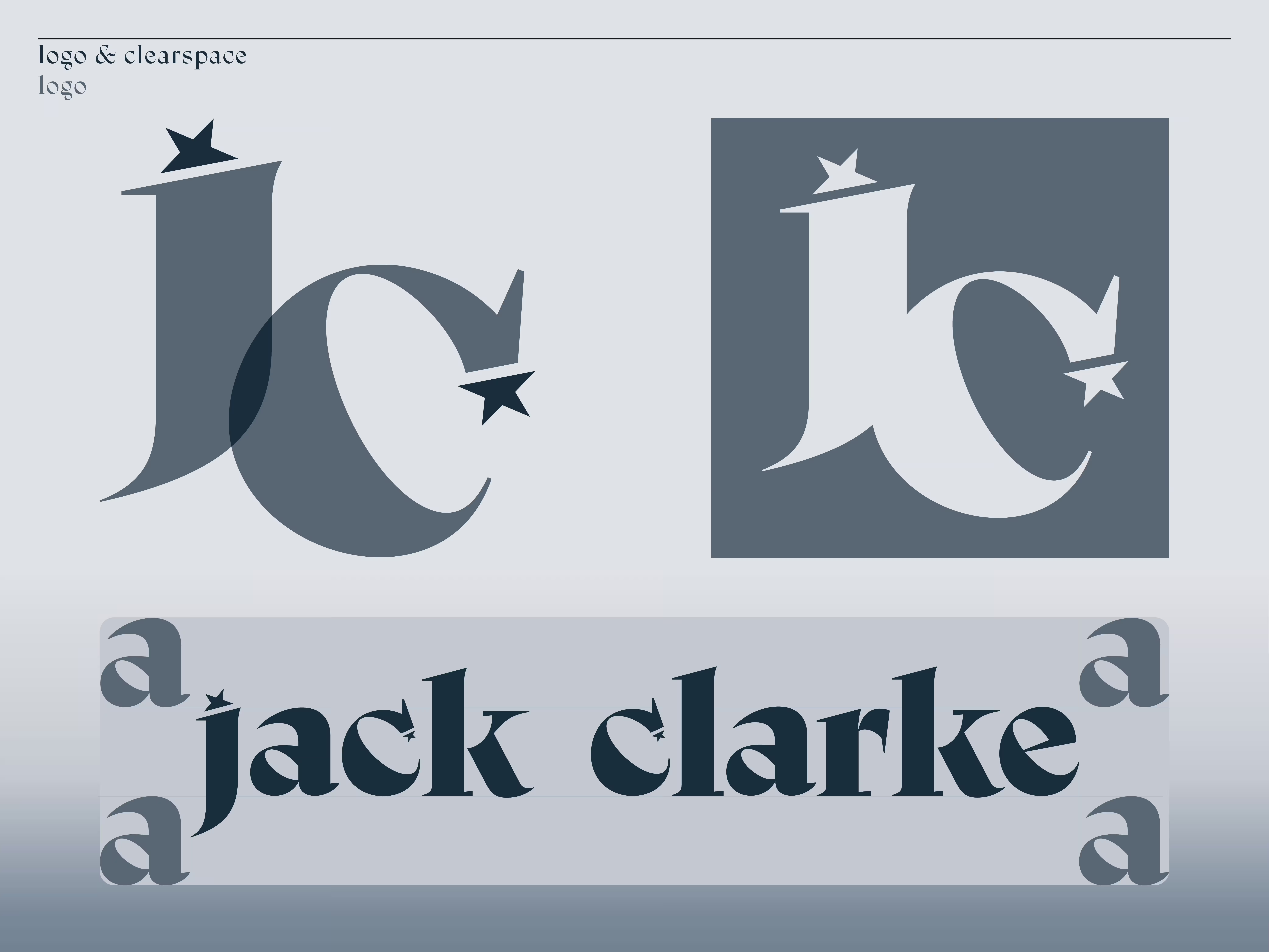
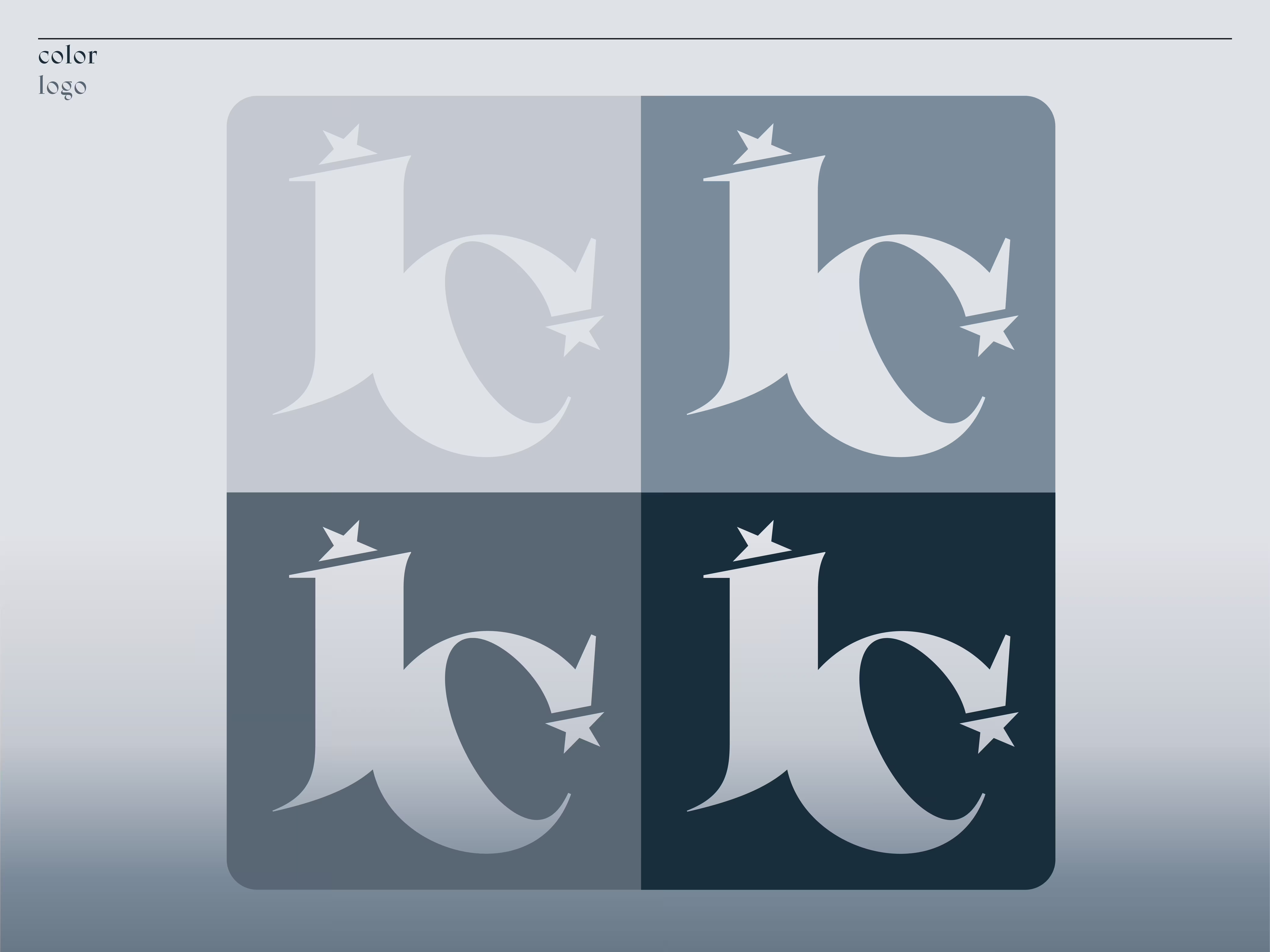
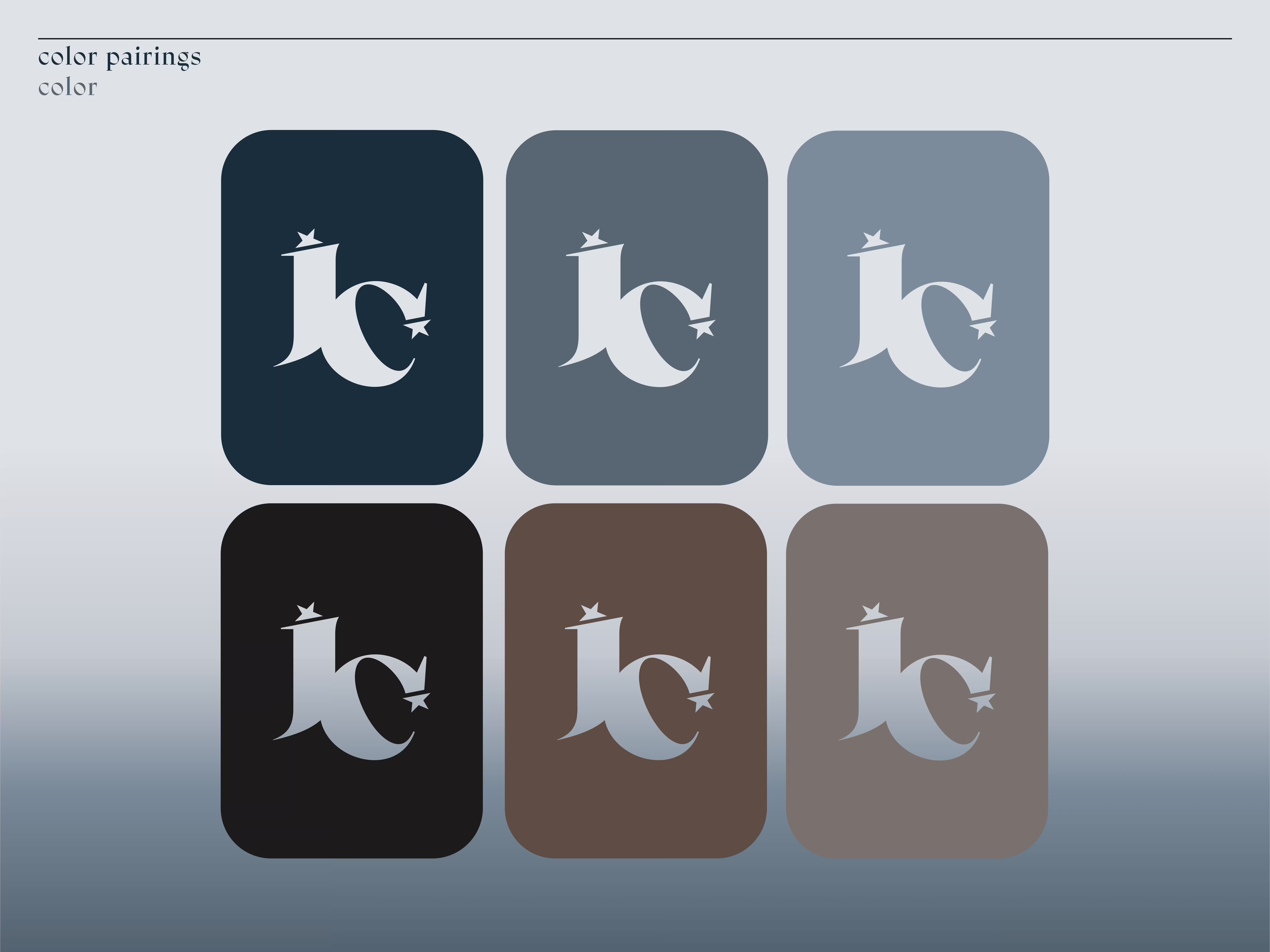
My personal brand identity is built around clarity, adaptability, & thoughtful design. Every element, from the stylized “JC” initial mark to its supporting assets is designed to communicate purpose & precision. The mark, paired with guiding stars, maintains balance & versatility through careful spacing & proportion, ensuring universal recognition across all formats. The goal was to create a cohesive visual system that reflects personality while remaining flexible for diverse applications.
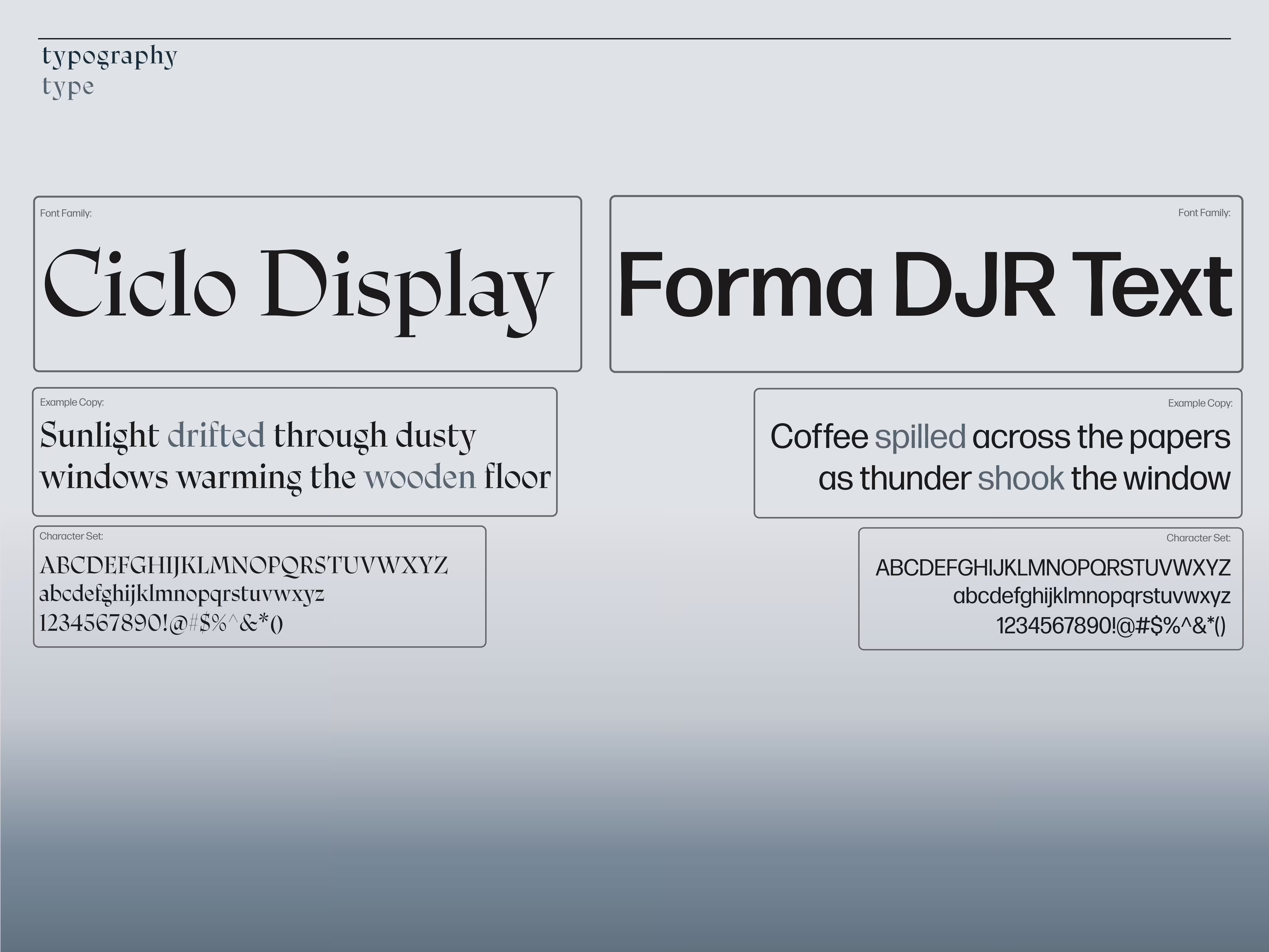
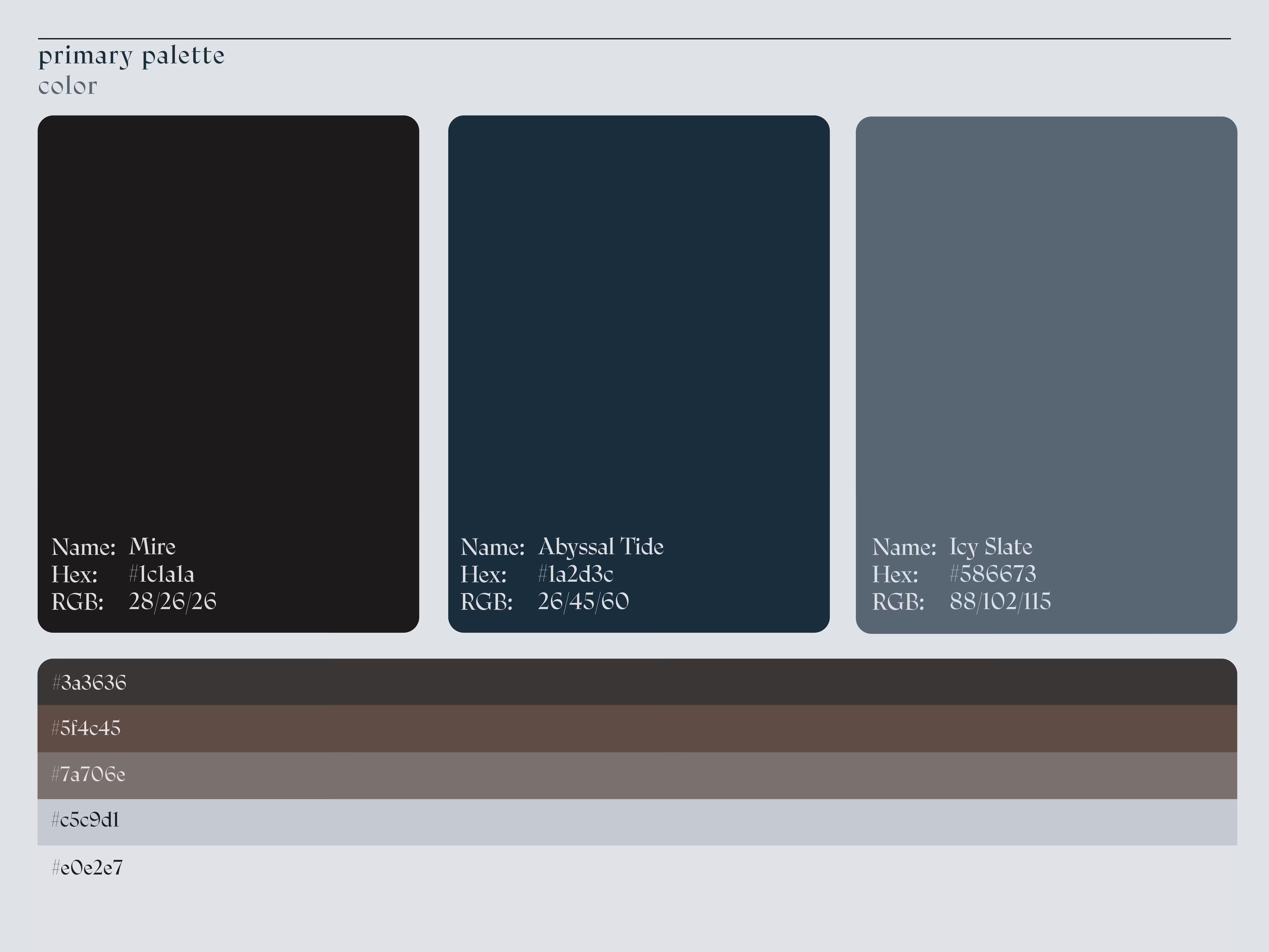
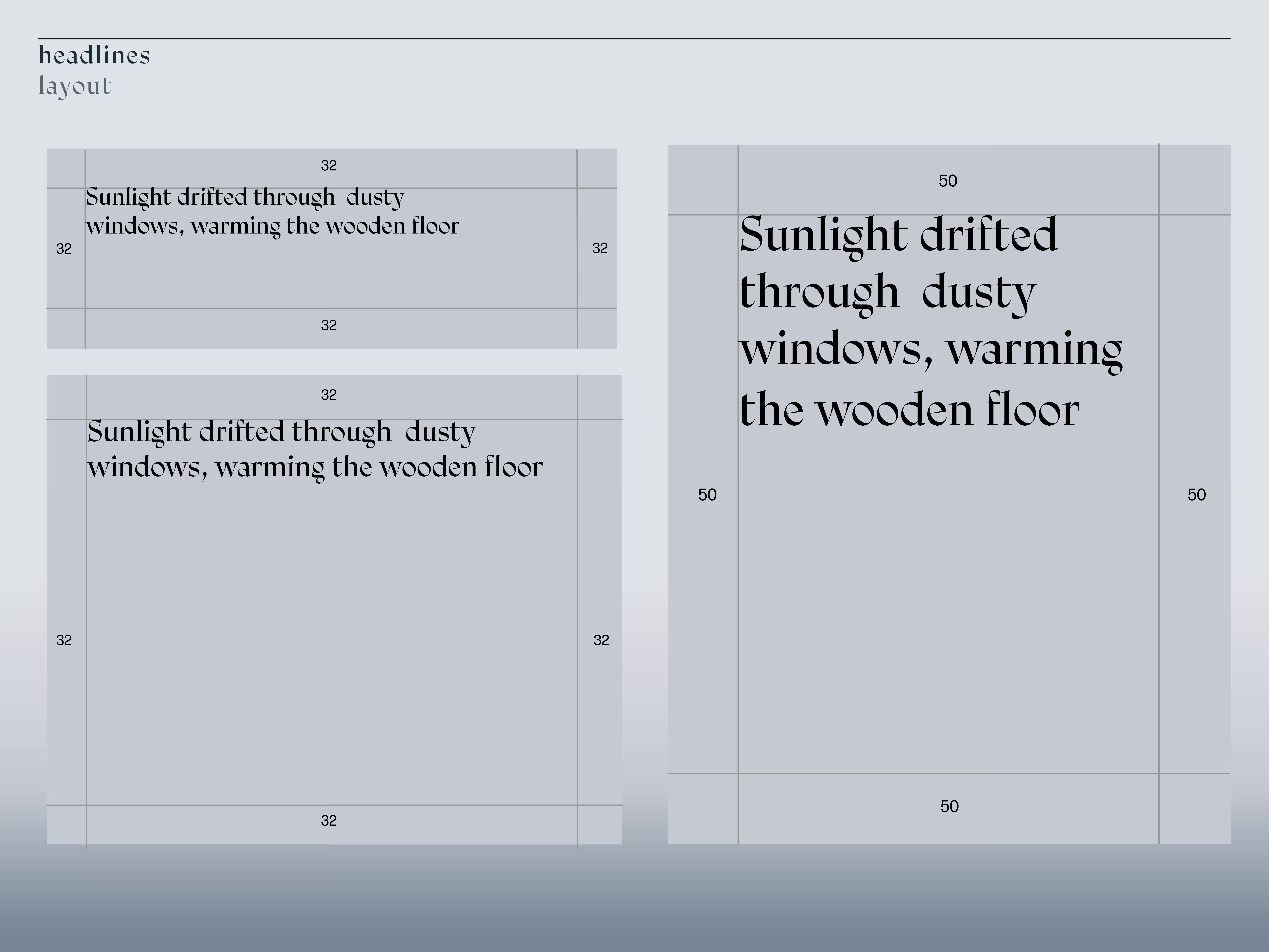
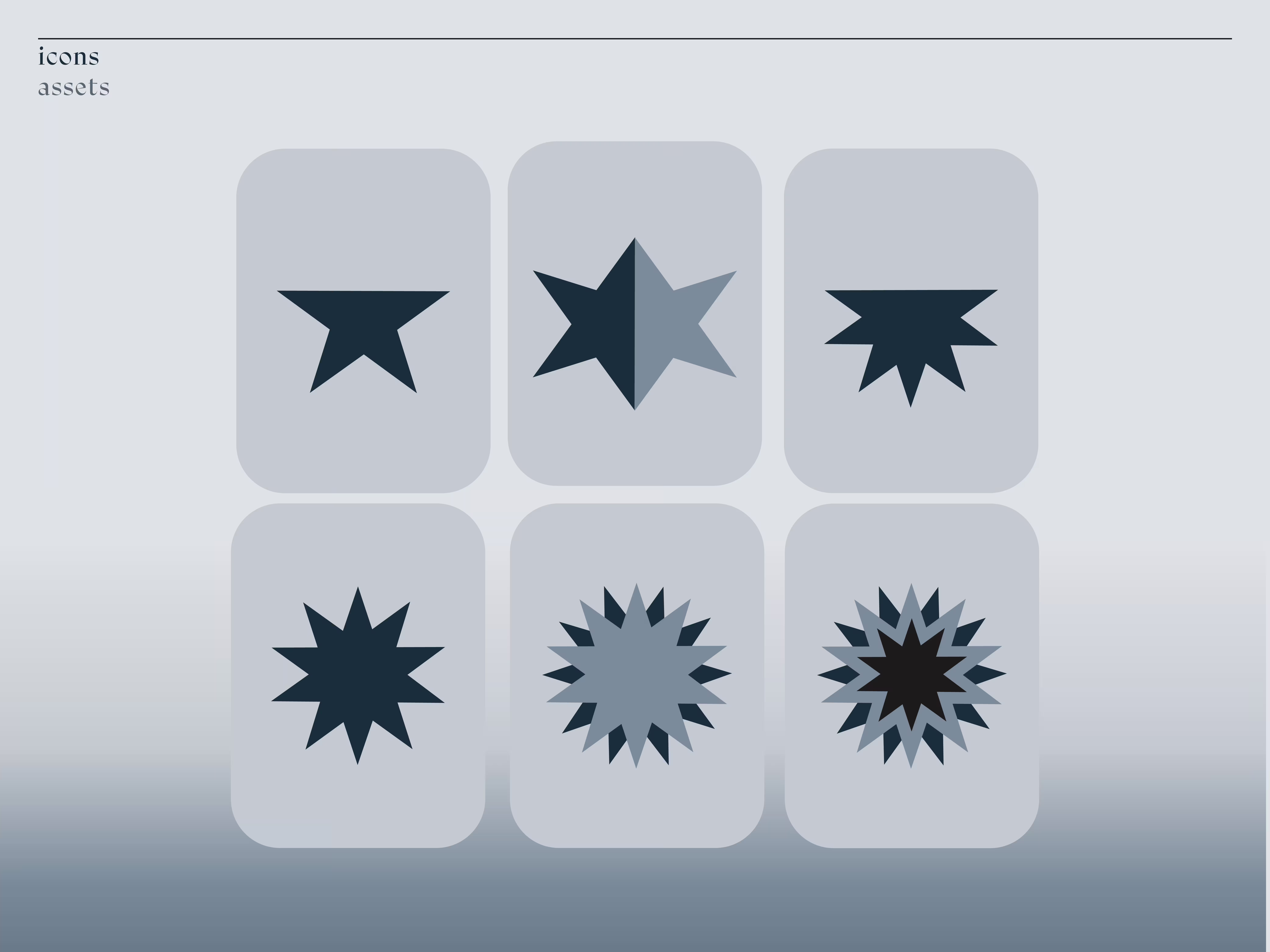
The branding system was developed with attention to color, typography, & adaptable elements: Color: The primary palette of Mire, Abyssal Tide, & Icy Slate conveys depth & emotion. Supporting pairings expand flexibility for both expressive & minimal applications. Typography: Carefully chosen typefaces balance personality with legibility & structure, complementing the sharp, refined tone of the brand. Visual Cohesion: Logos, layouts, headlines, icons, & supporting assets are unified through consistent hierarchy & rhythm, ensuring the brand feels intentional in every context. Each decision prioritized flexibility, recognizability, & a sense of purpose across mediums.
The final brand identity establishes a consistent, adaptable visual system that works across all formats & projects. By combining a strong mark with thoughtful color, type, & supporting assets, the system maintains cohesion while allowing creative flexibility. The result is a personal brand that communicates clarity, style, & professionalism, while remaining versatile enough to support any design application.

